Placing Objects
General Information
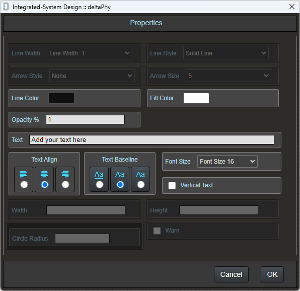
Most objects except for components, will be placed with the default line style, thickness color, background color and opacity
These default properties can be changed from the toolbar using the following buttons:


The applied properties can also be changed by:
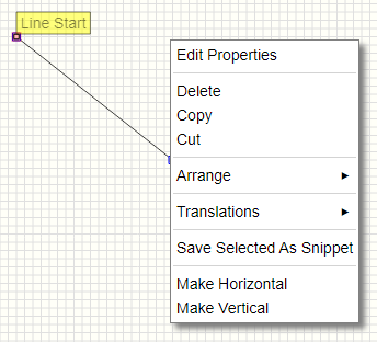
- Right-clicking an object point and selecting Edit Properties from the pop-up menu
- Double-clicking an object point
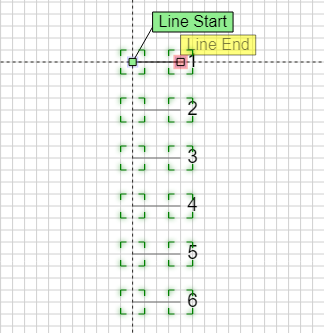
Lines can be made vertical or horizontal by right-clicking and selecting 'Make Horizontal' or 'Make Vertical' respectively from the pop-up menu.
Selecting a point for dragging
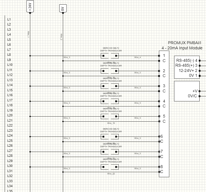
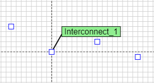
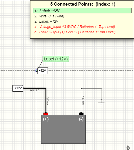
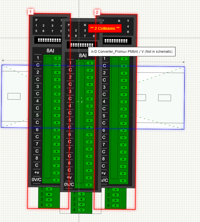
When you hover the mouse over an object point, if there is more than 1 object point under the mouse, then the Overlapping Points list will be displayed in the top right corner of the screen.
Apart from displaying a list of connected electrical points, the overlapping points list is also used to select an overlapped point under the mouse so you can drag it.
This includes any graphic point such as a rectangle or line graphic point.
In this image of a line and rectangle object, the line end-point is overlapped with the rectangle start-point.
We need to drag the rectangle start-point, but if we drag (hold left mouse button and move mouse) it will be the line end-point that is dragged:

Select the rectangle start-point using either:
SPACE BAR or ↑ / ↓
Now you will be able to drag the rectangle start-point.
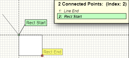
Note: You can only drag a point if it is directly under the mouse. A point that is selected in the list which is connected by a wire or label is unable to be dragged (unless it is direcly under the mouse).
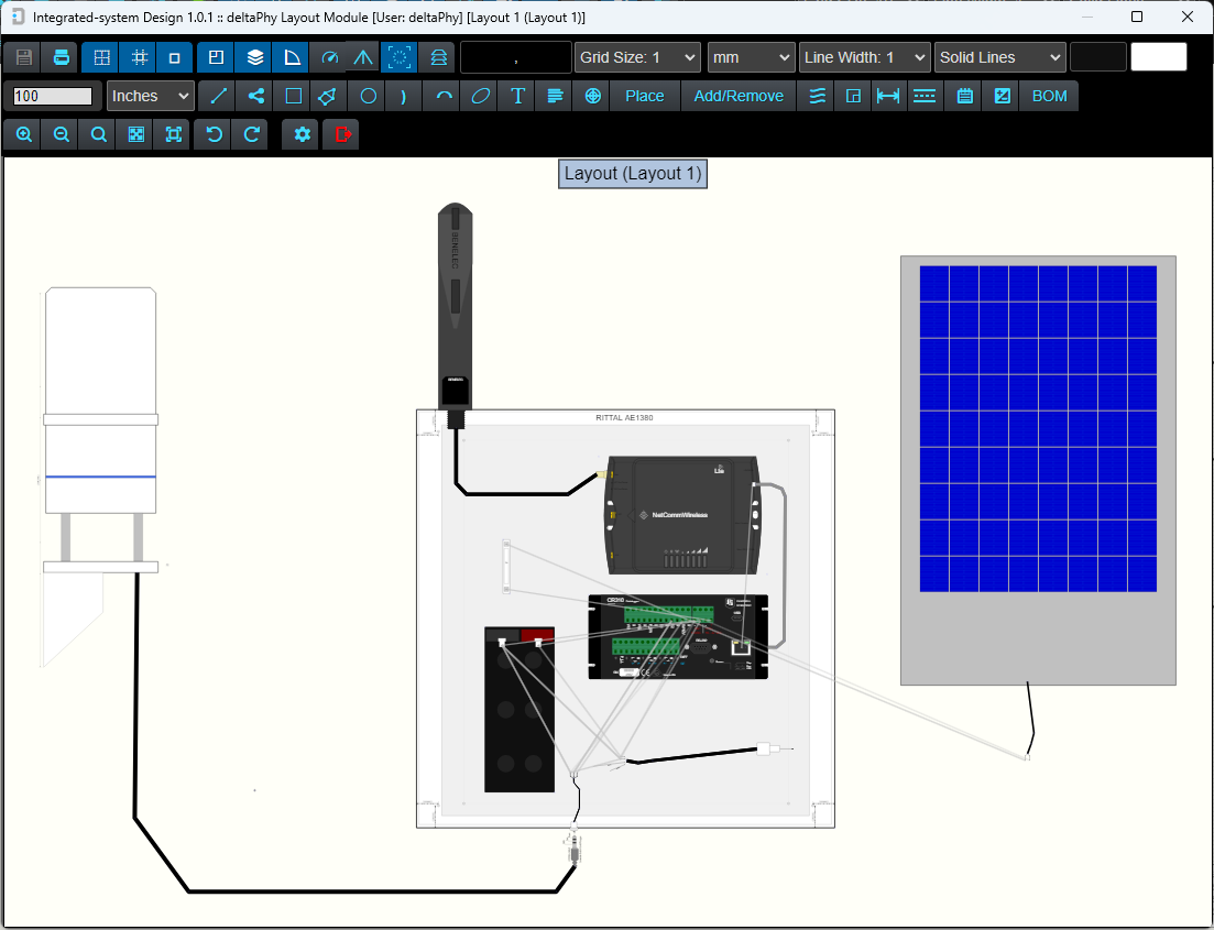
During the placement of many graphic objects, information about the size and angle of the object will appear at the bottom of the screen.

The length parameter shown is only for the line segment defined by the point hovered on back to the previous point.
A total wire length for each wire type is available from the Layout Editor's Bill of Materials dialog.
Placing Graphic Objects

Place Line
- Click on the line button.
The text Click on line start point will appear near the mouse cursor. - At this point, right-clicking the mouse will cancel the line placement.
- Left clicking the mouse will create a line start point.
The text Click on line end point will appear near the mouse cursor. - At this point, right-clicking the mouse will reset the placement back to
Click on line start point. - Move the mouse to draw the line out where you want it to go.
- You can 'pan' the schematic by dragging with the right mouse button.
- Left-click the mouse to finish placing the line
- The software will now be ready to place another line. Either right-click the mouse to cancel or press the ESC button on the keyboard.
Note: lines do not act as wires.
Lines can be made vertical or horizontal by right-clicking and selecting 'Make Horizontal' or 'Make Vertical' respectively from the pop-up menu.
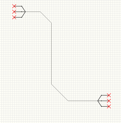
Example Line Graphic
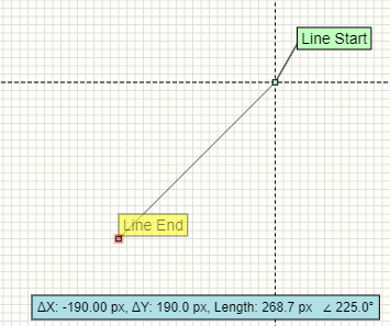
This example of a line graphic also shows the angle and length attributes that are displayed near the bottom of the screen when a line point is hovered on.

Place Polyline
- Click on the polyline button.
The text Click on polyline start point will appear near the mouse cursor. - At this point, right-clicking the mouse will cancel the polyline placement.
- Clicking the ← (backspace) keyboard button will delete the last point.
- Left clicking the mouse will create a polyline start point.
The text Click on polyline mid points will appear near the mouse cursor. - At this point, right-clicking the mouse will reset the placement back to
Click on polyline start point. - Move the mouse to draw the polyline out where you want it to go.
- You can 'pan' the schematic by dragging with the right mouse button.
- Left-click the mouse to finish placing the polyline
- The software will now be ready to place another polyline. Either right-click the mouse to cancel or press the ESC button on the keyboard.
Note: polylines do not act as wires.
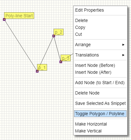
Note: Polylines can be converted to polygons by right-clicking
on a polyline point and selecting: Toggle Polygon / Polyline

Place Rectangle
Rectangles consist of two points: Start Point and End Point.
- Click on the rectangle button.
The text Click on rectangle start point will appear near the mouse cursor. - At this point, right-clicking the mouse will cancel the rectangle placement.
- Left clicking the mouse will create a rectangle start point.
The text Click on rectangle end point will appear near the mouse cursor. - At this point, right-clicking the mouse will reset the placement back to
Click on rectangle start point. - Move the mouse to draw the rectangle out where you want it to go.
- You can 'pan' the schematic by dragging with the right mouse button.
- Left-click the mouse to finish placing the rectangle
- The software will now be ready to place another rectangle. Either right-click the mouse to cancel or press the ESC button on the keyboard.
Example Rectangle Graphic

This example of a line graphic also shows the width and height attributes that are displayed near the bottom of the screen when a rectangle point is hovered on.

Place Polygon
- Click on the polygon button.
The text Click on polygon start point will appear near the mouse cursor. - At this point, right-clicking the mouse will cancel the polygon placement.
- Left clicking the mouse will create a polygon start point.
The text Click on polygon mid points will appear near the mouse cursor. - At this point, right-clicking the mouse will reset the placement back to
Click on polygon start point. - Clicking the ← (backspace) keyboard button will delete the last point.
- Move the mouse to draw the polygon out where you want it to go.
- You can 'pan' the schematic by dragging with the right mouse button.
- Left-click the mouse to finish placing the polygon
- The software will now be ready to place another polygon. Either right-click the mouse to cancel or press the ESC button on the keyboard.
Note: polygons do not act as wires.
Note: Polygons can be converted to polylines by right-clicking
on a polygon point and selecting: Toggle Polygon / Polyline

Place Circle
Circles consist of two points: Start Point and End Point (radius).
- Click on the circle button.
The text Click on circle start point will appear near the mouse cursor. - At this point, right-clicking the mouse will cancel the circle placement.
- Left clicking the mouse will create a circle start point.
The text Click on circle end point will appear near the mouse cursor. - At this point, right-clicking the mouse will reset the placement back to
Click on circle start point. - Move the mouse to draw the circle size out where you want it.
- You can 'pan' the schematic by dragging with the right mouse button.
- Left-click the mouse to finish placing the circle
- The software will now be ready to place another circle. Either right-click the mouse to cancel or press the ESC button on the keyboard.
Example Circle Object


Place Curve
Curves consist of three points: Start Point, End Point and Adjustment Point.
- Click on the curve button.
The text Click on curve start point will appear near the mouse cursor. - At this point, right-clicking the mouse will cancel the curve placement.
- Left clicking the mouse will create a curve start point.
The text Click on curve end point will appear near the mouse cursor. - At this point, right-clicking the mouse will reset the placement back to
Click on curve start point. - Move the mouse to draw the curve size out where you want it.
- You can 'pan' the schematic by dragging with the right mouse button.
- Left-click the mouse to place the end point of the curve base.
- Define Curve Shape will now appear near the mouse cursor.
- At this point, right-clicking the mouse will reset the placement back to
Click on curve end point. - Left-click the mouse to finish placing the curve
- The software will now be ready to place another curve. Either right-click the mouse to cancel or press the ESC button on the keyboard.
After the curve is placed, the points can be dragged to reshape it.
Often you may need to show point handles to help locate points such as the adjustment point. Point handle display is toggled using the TAB
keyboard button or by clicking the  toolbar button.
Example Curve Object


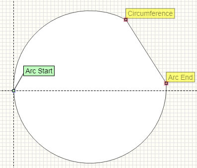
Place Arc
Arc placement is the same as curve placement except that the last point placed is a circumference point rather than an arc 'shape' point.


 in the toolbar.


 button next to the Default database tab to open the parts picker dialog. This dialog uses the same database as the parts picker, but displays it differently.


 toolbar button. Clicking This
button will toggle the enforcement. If the toolbar button is colored blue, the feature is active. If it has a dark background, the feature is inactive.
toolbar button. Clicking This
button will toggle the enforcement. If the toolbar button is colored blue, the feature is active. If it has a dark background, the feature is inactive.


 toolbar button.


 attached to it.


 toolbar button to enable (or disable) schematic entries to act as labels)


 box is checked in the Component Library Editor user settings dialog.